

Learn: DataCamp's Power BI Fundamentals


Why should software engineers learn how to use BI tools?
Developers often over-index on building custom software for business problems that can be solved with existing off-the-shelf software solutions. Said another way,
Engineers love reinventing the wheel.
Selecting the "right tool for the job" is the cornerstone of pragmatic software development. But, that's easier said than done, and it can be challenging for engineers who turn their nose up at "low-code" or even "no-code" tools.
Business intelligence software won't replace your front-end, but it might simplify one-off tasks or make it easier to collaborate with less technical folks within an organization.
Learning the basics of business intelligence software provides yet-another tool for software engineers who want to deliver value. Plus, understanding the capabilities of those working in tech-adjacent roles helps ensure engineers select the right tool for the job.
A few ways that BI familiarity can help software engineers:
- BI tool experience helps front-end engineers understand when it makes sense to recommend a BI tool rather than a bespoke, hand-coded dashboard for internal reporting
- Back-end developers and data engineers can use BI tools to better understand and explore the business' data model. This creates shared understanding and language around the domain, which simplifies communication & collaboration ✨
- A cursory overview of BI tools allows product-oriented developers to understand how business analysts help inform product development decisions. Developers can even wield BI tools to facilitate data-driven product development!
Work Smarter, Not Harder
The rise of ChatGPT has left many of us reflecting on the role software engineers will play in the burgeoning era of AI-infused business professionals. It's unlikely that AI will render software engineers redundant in the short term. But, it is reasonable to expect that the role of engineers will evolve alongside these new technologies.
While developers may feel an inclination to double-down on their preferred technical niche, a lot of professional momentum can be gained from combining technical expertise with business literacy. For now, software engineers focused on expanding the breadth of their knowledge will have an edge in identifying novel opportunities to introduce value.
While I wouldn't necessarily recommend building an entire career on Power BI in 2024, adding it to the quiver will help those regularly working with datasets in a business context for the foreseeable future.
The DataCamp Power BI Fundamentals "Skill Track"
I focused the last ten years of my career on building full-stack web applications with technologies like JavaScript, React, and Node for early-stage startups, Fortune 500s, and a west coast tech company.
With the last decade of my life obsessed with all things web-development, I haven't spent much time thinking about "business intelligence" or data-visualization tools.
As a DataCamp subscriber with a desire to learn more about the modern state of business intelligence software, I enrolled in the platform's Power BI Fundamentals "skill track." The track features 6 interactive Power BI courses designed to take learners from "zero to hero."
While the courses ended up being well outside the day-to-day life as a software developer, I found the "Skill Track" a good use of my time.
How long did the "Skill Track" take to complete?
I spent a little over 10 hours completing the track.
Working as a software engineer for a decade provided a solid foundation to learn Power BI. I would expect someone who is unfamiliar with programming, data visualization, and data modeling to spend more time working through the track.
The DataCamp platform suggests ~17 hours to complete the 6 courses within the "Skill Track." This may be a good estimate for learners entering the program with a cursory knowledge of data analytics.
Power BI on Virtual Machines
DataCamp provides virtual machines (VMs) to run the interactive Power BI exercises. This came as a pleasant surprise, as I initially started working through the course on a Macbook.
Unfortunately, working through the courses on my Mac didn't last long!
I ended up installing Power BI desktop on a Windows machine as I progressed through the courses.
Using the VM for some courses is faster, such as when making trivial changes to a Power BI report during the introductory courses. But, other courses didn't hold up well when using the VM.
For example, the DAX course's VM slowed to a crawl at a couple of points, and connectivity issues caused the environment to reload every couple of minutes in another course.
While your experience with the VMs might differ, I recommend working through the course with a local Power BI install. The VMs should be sufficient to advance through the material, but I found the experience to be smoother when working with a lower Power BI install.
The Courses
1. DataCamp: Introduction to Power BI
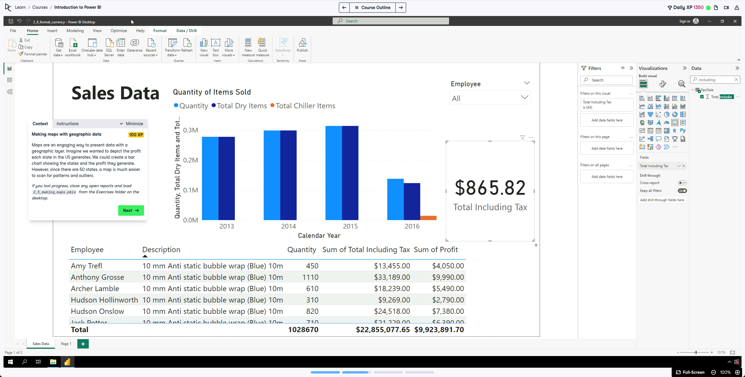
Time to complete: 1 hour 45 minutes
Description
Gain a 360° overview of exploring and using Power BI to build impactful reports. In this course, you’ll go from zero to hero as you discover how to use this popular business intelligence platform through hands-on exercises. Before diving into creating visualizations using Power BI's drag-and-drop functionality, you’ll first learn how to confidently load and transform data using Power Query and the importance of data models. You’ll also learn to drill down into reports and make your reports fully interactive. You've got the power!
Overview
The above description does a good job highlighting the course. It's a foundational course in the series and useful for anyone who is unfamiliar with Power BI's user-interface.
The course covers a few of the different views available in Power BI -- It demonstrates loading multiple datasets in the Data view, building a data model to establish relationships between tables in the Model view, and creating an interactive report in the Report view. The course also included practice sessions using Power Query Editor to prepare and clean data for analysis.
The course also provides an overview into modifying and formatting various visualizations, ranging from matrices to donut charts. It guides participants in the creation of hierarchies to facilitate "drill-down paths" within reports. It also provides an introduction to sorting, filtering, and managing interactivity in report visualizations.
Overall, the course is worth taking if you're unfamiliar with the Power BI UI. I might opt to skip it if I already had some Power BI exposure.
2. DataCamp: Introduction to DAX in Power BI
Time to complete: 1 hour 15 minutes
Description
Start your journey to becoming a DAX master with this introductory course on DAX. You’ll learn fundamental concepts and best practices for implementing DAX in your reports. You’ll learn to write DAX code to generate calculated columns, measures, and tables while learning supporting knowledge around ‘context’ in Power BI. Finally, we’ll round off the course by introducing time-intelligence functions and show you how to use Quick Measures to create complex DAX code. Let’s take the first step in your DAX mastery journey!
Overview
This course delves into several foundational aspects of DAX, unraveling its intricacies and applications.
DAX, short for "Data Analysis Expressions," is a formula language to create calculations. The language is similar to Excel's formulas and powerful out of the box, particularly for those already familiar with programming concepts.
It kicks off with a short overview of a subset of functions integral to DAX scripting. It introduces the concept of "context" and its application within the Power BI framework.
The course specifically covers "row" and "filter" contexts before exploring calculations using:
SUMX(<table>, <expression)CALCULATE(<expression>, [<filter>])CALENDAR(<start_date>, <end_date>)
3. DataCamp: Data Visualization in Power BI
Time to complete: 1 hour 30 minutes
Description
Power BI has extraordinary visuals that can be used in reports and dashboards. In this Power BI course, you’ll learn to create insightful visualizations through built-in and customized charts and conditional formatting. You’ll discover how to create a plethora of visualizations such as scatter plots, tornado charts, gauges, and how to visualize everything without overwhelming your audience.
Overview
As someone with extensive experience writing software to build user-interfaces, this course didn't introduce a ton of new concepts. Though, someone less familiar with UI design will benefit from the course.
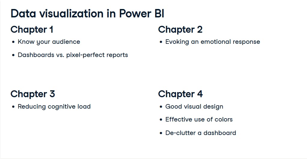
It introduces learners to the key elements of good visual design in the context of Power BI reports:
- Thinking about the "story" you're telling with data
- Questioning whether an element contributes to the data "story"
- Exploring the impact of pairing data with the "right" visual element
- Examining how less-can-be-more in design
It also encourages participants to tailor their report pages to a specific audience, and to focus on one data story per report page.
Avoiding confusion while telling a data story with information-rich visuals is challenging! This course provides an introduction to important considerations for those balancing data with design.
4. DataCamp Case Study: Analyzing Customer Churn in Power BI
Time to complete: 2 hours
Description
Are you ready to apply your Power BI skills to a real-world dataset? For subscription-based businesses, reducing customer churn is a top priority. In this Power BI case study, you'll investigate a dataset from an example telecom company called Databel and analyze their churn rates. Analyzing churn doesn’t just mean knowing what the churn rate is: it’s also about figuring out why customers are churning at the rate they are, and how to reduce churn. You'll answer these questions by creating measures and calculated columns, while simultaneously creating eye-catching report pages.
Overview
While the preceding courses provide extensive hand-holding for learners, this case study encourages students to apply their Power BI knowledge in an engaging real-world use case.
In the case study, students analyze the churn rate for a fictional company, Databel. Through the analysis, learners look at various dimensions of Databel's products, operations, and customer demographics to understand the company's churn rate.
This ended up being my favorite course in the skill track. It was fun, and the approach of the case study proved helpful in solidifying the previous courses learnings. Highly recommended! 💯
5. DataCamp: Data Preparation in Power BI
Time to complete: 1 hour 15 minutes
Description
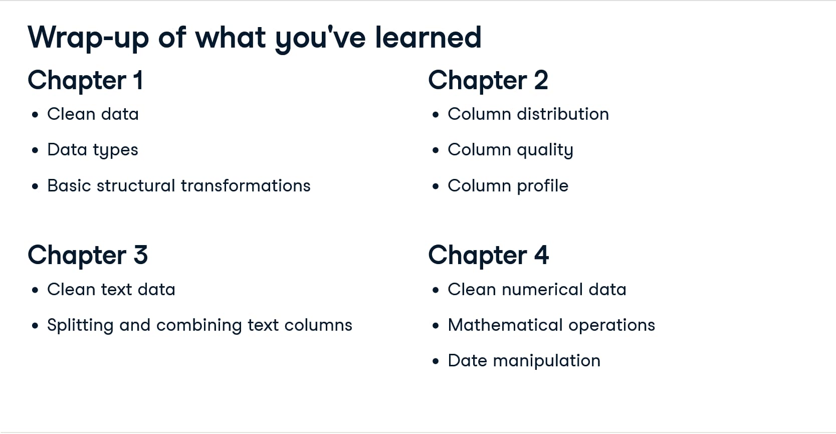
In this interactive Power BI course, you’ll learn how to use Power Query Editor to transform and shape your data to be ready for analysis. You’ll also get to grips with various text and numerical transformations, including multiplication, rounding, and split and merge text columns, to help you become even more efficient in data preparation.
Overview
As bad data is costing the US over $3 trillion, spending an hour learning how to clean up your departments spreadsheets in Power BI is a worthwhile investment.
The Data Preparation in Power BI course is an efficient foray into Power Query, which allows Power BI users to clean, transform, and preview data.
The course is valuable for anyone working with spreadsheets or CSV files regularly, and it is particularly useful those who want to learn how to quickly transform dirty data into something more usable for analysis.
The course also introduces "Data Previews," which are a helpful tool to quickly understand a dataset's quality -- even for developers!
The instructor shares a 1-10-100 Rule, which I like a lot. The general idea is that is costs a business $1 to verify data, $10 to clean data, and $100 if you do nothing at all with the data.
- $1 to verify data
- $10 to clean data
- $100 if you do nothing at all
I have heard something similar related to the cost of bugs in software, with the moral being it's cheaper to resolve bugs prior to releasing software than after code is shipped to production.
In software development, the cost to fix an error found after product release is then four to five times as much as one uncovered during design, and up to 100 times more than one identified during the maintenance phase. In other words, the cost of a bug grows exponentially as the software progresses through the software development lifecycle.
It sounds like this exponential effect can similar be applied to data analytics problems!
6. DataCamp: Data Modeling in Power BI
Time to complete: 1 hour 30 minutes
Description
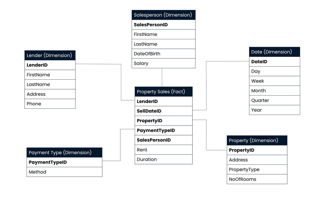
Proper data modeling is the foundation of data analysis and creating reports in Power BI. This course lets you explore a toolbox of data cleaning, shaping, and loading techniques, which you can apply to your data. You'll get to know how to choose between Power Query and Power BI, and discover the foundations of data modeling by going into star and snowflake schemas. You'll apply all of this to real-world datasets issued by the United States Census Bureau.
Overview
Data Modeling in Power BI introduces the concept of "Star" and "Snowflake" data models. If you're already familiar with relational databases, relational data modeling, and/or SQL at a professional level, then this course can be easily summarized as, Power BI prefers star data schemas.
If you're less familiar with relational data modeling, this course is beneficial in that it combines concepts with application to cement learning.
I found the course useful in expanding my familiarity with Power BI as well as a few new formal data modeling vocab words.
Reflections
On DataCamp
I completed a single DataCamp course prior to starting this course, an Introduction to R in 2018. Although I didn't stick with R language programming as a result of that course, it is great to see the improvements made to the platform in the time since.
My experience with some of the Power BI virtual machines left something to be desired. But overall, the courses' content was applicable to my interests and the platform made getting familiar with Power BI borderline enjoyable, which on paper is a feat in itself.
On Power BI
In pure business speak, Power BI truly feels like a "powerful analytical tool." I'm glad I took the time to complete the course -- I'm already thinking about ways to use it to clean and visualize datasets.
On a less positive note - there is an incredible amount of room for improvement when it comes to the visualizations' aesthetics. Power BI's utility is matched with a distinct ability to help business intelligence analysts create dashboards that make designers cringe.
I'm looking forward to the future of aesthetically pleasing business intelligence dashboarding. Until then, I'll keep slicing & visualizing data with Power BI.